This text is a remix of a little interview I gave to Angela Riechers, originally published on AIGA Eye on Design on March 27 2018.
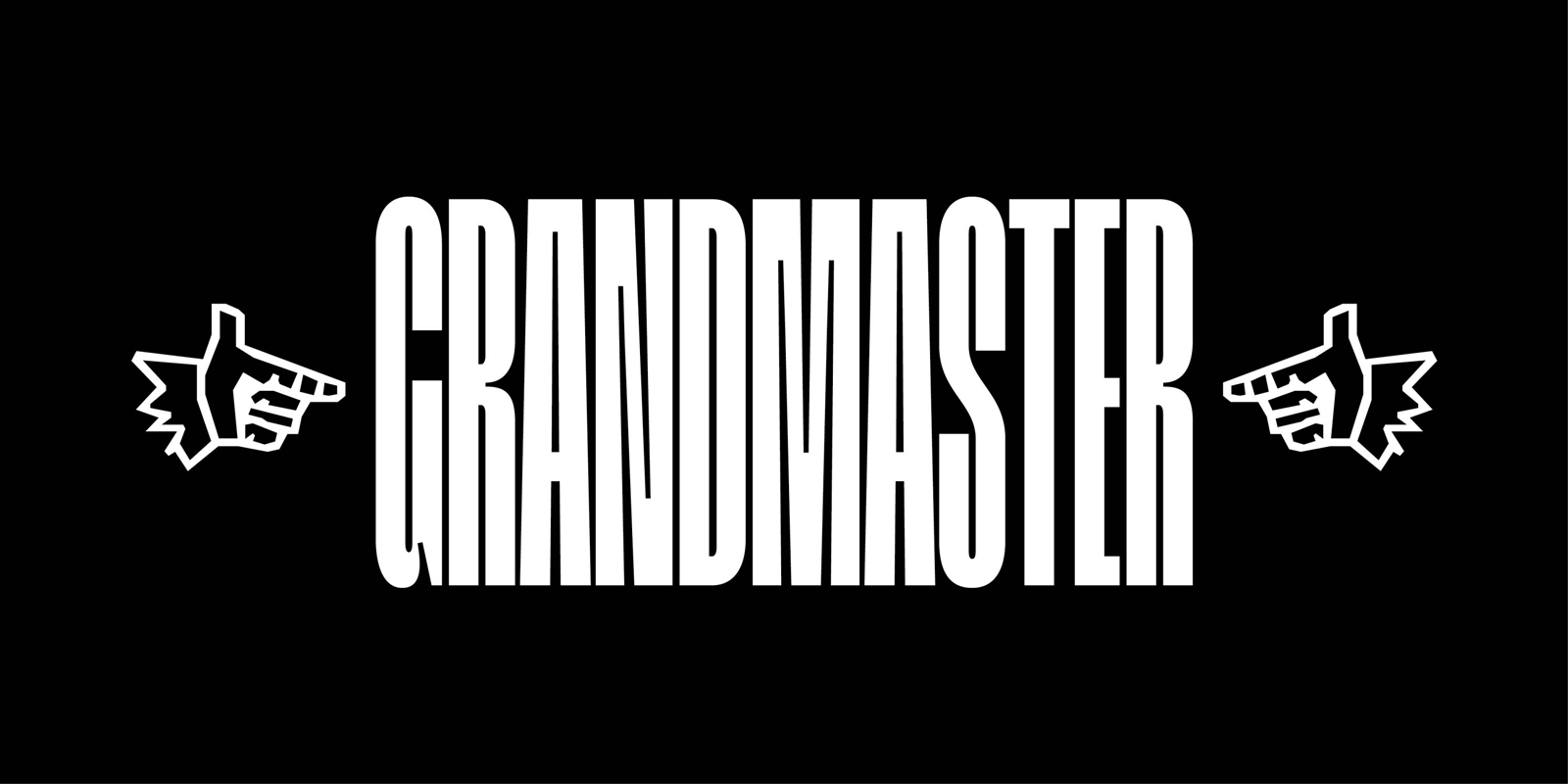
The very condensed Grandmaster is a take on exploring the border between text and abstraction. Inspired by 20th century Antique fonts as well as by early hip-hop artists, the extremely vertical structure and the regularity of its shapes and counter-shapes make it an almost-kinetic titling typeface, perfect for any incisive editorial layout.
Type is a system in which each word is a group of predefined shapes, expected to be legible. And our eyes rely on proportions and recognisable features to decipher and read these shapes in their temporary arrangement. But all of this could easily be pushed a little closer to abstraction, each letter could go back to being just a shape, a stem to being just a line, not so recognisable from the next. This idea was the starting point for Grandmaster. I wanted to imagine letters in terms of a constant rhythm, almost like a DJ looping a very short segment of song — Grandmaster Flash, who gave the typeface its name, established such a technique called punch phrasing.
The challenge in designing Grandmaster was to find a point where everything would look kind of wild yet very controlled, like one would freestyle over a regular beat. And just like a skilled MC is able to fit an impressive amount of words in one short measure, the typefaces tries to press and squeeze letters in a very reduced space.
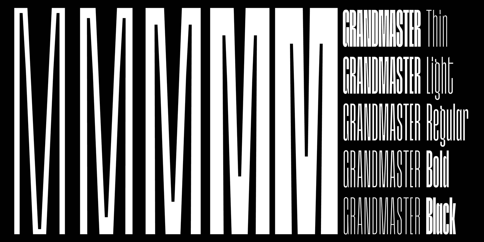
The family started in early 2017 with the Black weight, which at first was just an experiment on having a spacing equal to the counter-shapes. Inspired by works like Adrian Frutiger’s Antique Press 59, I wanted to push the condensed aspect one step further in developing a feeling of confusion, on the edge of being an optical illusion. The same impression one can have when walking and looking up at very high and edgy architecture.
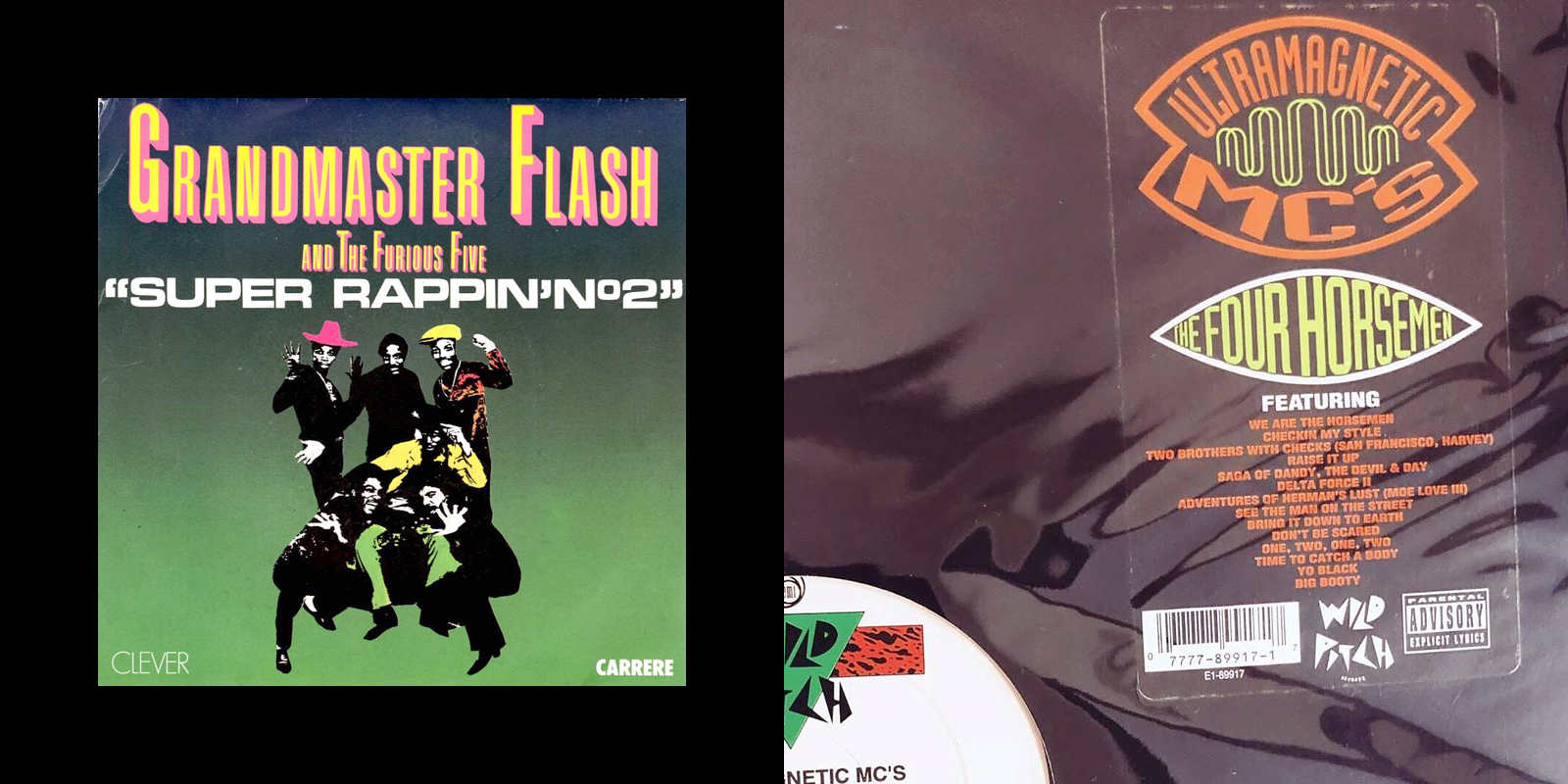
It is while listening to NYC hip-hop artists such as Afrika Bambaataa or the Ultramagnetic MC’s that I imagined that the one cut could become more of a system, a family where the weight would vary while the width would always stay the same, just like flows and melodies can change even when the beat and rhythm don’t. Early hip-hop inspired me in its use of very expressive typefaces on flyers and album covers, but there was something else related to lines and sequences, I can’t really define — is it the iconic three-stripes sports clothing brand, or the ‘White Lines’ from Grandmaster Melle Mel’s 1983 classic?

The aim with Grandmaster was to have a strong visual feeling before even reading anything. Thus, it is only once the regularity and general kinetic look was set that I allowed myself to add a more particular flavour to some of the letters, something slightly more organic, like in the capital G and Q — almost like a cat trying to find the most comfortable position inside a narrow cardboard box. Other complex letters, like M and N, were also very interesting to design and balance, especially in the heavier weights.
Grandmaster’s design evolved through its use. It’s one of the interesting aspects of being both a type and graphic designer, I was able to test the typeface along the way in various projects and build some of the features according to specific needs and situations. I really enjoy the idea that Grandmaster is not at all a sandbox or a workhorse that would allow you to make everything and anything, but already carries strong visual choices.
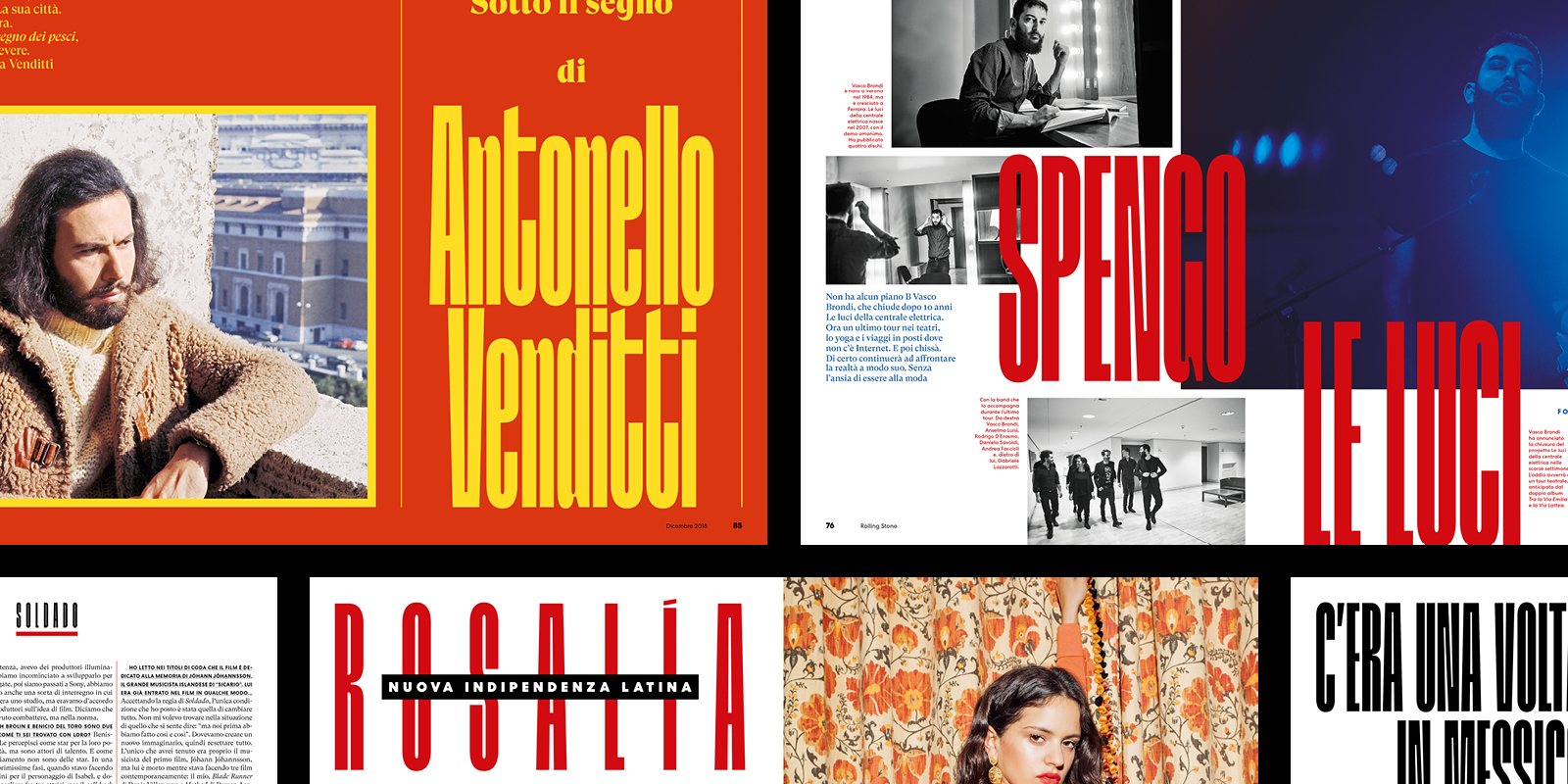
The family was designed with very tight and constructed magazine headlines and layouts in mind. This guided many decisions, such as the width of each letter staying the same across the weights, the diacritics being included in the letter’s height and one of the stylistic sets replacing all punctuation marks with thin variants.
Grandmaster is obviously a display typeface, crafted to work in big sizes, but I’d love to see it used for longer texts. Sure, it might hurt your eyes a bit, but also really flourish the type’s potential for abstraction. Although all in all, probably not a good idea for airport signage or a pocket book collection!
—
Grandmaster was designed by Lucas Descroix and released by The Designers Foundry in February 2018.
—
Get Grandmaster, or see it in use.